Initial thoughts and ideas:
 At first, I made some basic notes of my aims.
I quickly noticed that I wanted to create a music video, so I was already thinking in depth about obtaining a song to use. I noted down some artists I had in mind whose music correlates to my tags – melodic and instrumental.
I wasn’t too concerned about the genre yet, so I noted down both slower downtempo songs and also fast, catchy ones.
As I still had a lot of time, I quickly combined some available loops in Logic to see whether I could create the song on my own. I went for a catchy, melodic tune, but I didn’t intend to actually use it anywhere.
I just wanted to experiment with what I could come up with myself, but I was already sure I would prefer using an already created song which sounds professional so that I don’t have to worry about creating the soundtrack.
I will definitely ask for permission from the artists whose music I seriously consider to use so be exempt from copyright issues. I want to decide this in advance so that the artist has time to reply – they might be busy, so I’m taking that into account.
 In addition to the songs, I also made note of some aims or experiments I was willing to conduct.
It was a combination of techniques I hadn’t used before and some which I had tried at the beginning of the year.
I wanted to discover myself and what I found most enjoyable doing, so I made sure to take note of varied methods.
As I didn’t have a clear story in mind, I just wrote down some themes that interest me in hopes of developing a concept out of one of them, or just use them as a guideline of things I’m interested in.
At the end of the note, I continued writing down specific songs I could use, but I think I already had a song in mind even as I was adding more songs to the list (Haywyre’s Gridlock), and I talk about it in the next section.
Preparation for music soundtrack:
As I had come up with a basic premise for the video, I started to think more about the music I would use. I had decided to find some suitable track from an independent artist to give myself more time to work on the visual aspects of the film because, from previous experience on other projects, I know it takes me quite a lot of time to create a decent soundtrack myself.
I had two particular artists in mind due to their varying styles of music; I could definitely find a suitable track from either of them.
Haywyre (Martin Vogt) was the first person who came in mind because I really enjoy his surreal tracks with mellow piano pieces. His electronic, classical and jazz music influences can be recognized in every single song, and as he mixes various combinations of the genres fluently together, his style makes for very unique and innovative music. I feel great respect for him because every track flows so effortlessly, even with many different styles and instruments combined, and it sounds very professional.
He makes sure to be involved with his fans and supporters, therefore I felt confident asking him for permission to use his music, knowing it wouldn’t be in vain. 
Gramatik (Denis Jasarevic) is a Slovenian musician who can make pretty much everything from relaxing jazz, trip hop, swing, to upbeat electronic music and catchy rhythms. His wide range of different styles would allow me a great selection to pick from, especially when I don’t even have a detailed idea yet, so I could flexibly look for a fitting track. He’s a very realistic, down to earth person who supports piracy to the level of giving out his entire discography for free and earning his living through live performances instead. I had tried to find out online whether he has said anything about people using his music for personal videos, but the search deemed no results. I figured he would be alright with me using his music for a non-profit college project, but I still asked for permission to make sure.
A week after I had emailed Martin, he got in touch with me and said he was fine with it, making sure I understand that it’s as long as I don’t try to earn money off of it. I’m now content with using a song of his because I know I don’t have to worry about any copyright issues.
I was happy with using his song by the name of Gridlock, which I had used to theoretically align shots to before, as well as casually mentioning in my email when I asked for permission. Even if I considered other songs throughout the process, I noticed that I still tended to refer to Gridlock every time because of its surrealistic tones and mellow atmosphere.
It is essentially a slow song, but it has some intense parts, which make a very nice contrast and fit within the surreal mood.
Whenever I listen to it, I start thinking about macabre scenarios and alien landscapes, which yet again reassures me of the confusing mood the song can invoke.
I think I may have an interesting result trying to create a video for the song because of the ambivalent meanings people may conceive from listening to it and associating the visual footage with the beat.
Slow motion experiment:
I didn’t have a clear view how I would film my video, but I had a particular idea for a few shots because of the story I had devised at that time.
I was thinking of including some slow motion shots, but I wasn’t sure how it would actually look. I decided to experiment with my GoPro camera because it shoots at 60 frames per second, and I figured it would be useful to see whether that effect would be fitting.
I compiled a video of the process and some shots I achieved from the experiment. I wanted to use something fast paced to better emphasize the movement in slow motion, so I decided to try out the well known Coke and Mentos experiment.
The music is from Haywyre – the artist who gave me his permission to use his music, so I used it as a background track, practicing to fit video footage with a soundrack.
I went up the hill to the Epping forest, which is conveniently nearby our house. I figured it was the best place to make such a mess without getting in anyone’s way and worrying about cleanup – we were in an open enough space to not disturb any passersby.
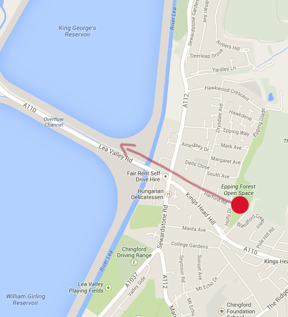
I also looked for a better view for the background – the photo shows our location and the view towards the reservoirs below.
We tried 2 litre Diet Coke and Diet Pepsi drinks to see which work better, but they seemed to have similar results. The small Diet Coke cans weren’t very aesthetically pleasant to watch because the eruptions weren’t very big, which probably has to do with the shape of the bottles and the narrow opening allowing for a more condensed flow.
Every experiment was useful for experience, no matter how bland.
I set up my Olympus E-PM1 camera to record the process from afar, setting it on a tripod and just letting it record. My sister helped out with carrying the equipment, my dad was controlling the GoPro from his phone, and I was in charge of the messy experiments.
We changed the camera angles occasionally to see how different shots work, and what looks best. The last clip in the video was the biggest success because of the interesting angle from below and how the lighting influenced the shot, giving emphasis to the erupting drink.
Eyepatch prop preparation:
One of the details I had chosen to be featured in my video includes and eyepatch. (Details on its relevance and the storyline on my Ideas page.)
I knew I needed to get the prop beforehand, but as I wanted to work with Polina as my main actress, I was also considering the comfort and durability of the eyepatch, as well as the visual look of it.
So instead of just picking up a cheap pirate cosplay eyepatch, which would probably not be very aesthetically pleasant to see, nor would it be durable or comfortable for the actress, I had planned to order a medical protective eyepatch with some padding.
 This was how it turned out, and I was quite impressed by how it looked – it was very sturdy and had an adjustable strap, so I didn’t have to worry about it not fitting properly on the actress’s head.
 The foam padding didn’t seem like it was the best quality, but it was more comfortable than a plain cloth eyepatch, and definitely looked better visually.
 I quickly tried it on to realistically evaluate how comfortable the eyepatch was and to see how it looked on a person. I also paid attention to how the hair folds when the strap goes over it tightly to decide whether to have the actress put her hair in a ponytail or let it loose.
I think the hair looks pretty good loose – the strap gives it an odd volume at the top, and I liked how it looks.
After Effects experiments:
After changing my thoughts on the techniques I would use in my video, I wanted to try out some experiments in After Effects. (More specifics about the change on my Ideas page.)
My aim was to see some ways of working with still images and adding movement to them. I still wanted the shots to be somewhat slow to better fit with the music soundtrack, but instead of video footage, I’ve decided to use photos.
I used this tutorial to follow, which encouraged me to go ahead and try my own experiments even more.
At first, I decided to try out the Displacement Map technique with a photo of my own – wolves at the zoo.
I was rushing with the experiments, so they’re very imprecise, but I mainly just wanted to get an understanding of my capabilities from quickly following a tutorial, as well as helping me remember the techniques for later use.
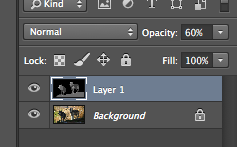
The technique is to create a layer of depth for the image to make it appear less flat. I opened the image in Photoshop and created a separate layer for the depth map. You can paint it in After Effects directly, but I find it more precise and easier to work with Photoshop.
I lowered the opacity of the depth map layer to see the image under. The darkest areas are an indication of something farther away, and the brightest – closest objects.
When I was finished with Photoshop, I started working in After Effects. I imported the Photoshop file as a composition to retain the separate layers.
 I found the Displacement Map effect in AE and changed the map display to Luminance to fit with the format.
This is a short demonstration of the effect I achieved. I was aware that this technique needs minimal movement, and as I tested in the video, the more the image gets shifted, the more distorted it looks.
However, with a mild amount of movement, it seems like a striking effect to pull off in slow motion, and I will keep this in mind for future reference.
 The next experiment I had already tried before – the parallax technique.
I chose this photo of some wallabies I had taken in a zoo because I figured it would be easier to edit the background for each layer that way.
 I imported the image in Photoshop and created separate layers for the closest two wallabies, and then I started editing out the background where those wallabies are sitting in order to later add movement to them in a 3D scene.
 I had extracted the wallabies onto separate layers, but the cut looks fake and stiff because of the straight edges..

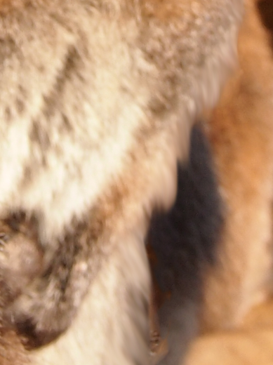 ..So I used the Smudge tool to create a fur-like effect on the edges and make them seem more natural.

 I then imported the Photoshop file as a composition in After Effects so that I retain the separate layers. Then I added a camera to the scene and checked the 3D boxes for each layer.

 I changed to Custom view to see the camera’s position from the side, and then I moved the wallaby layers with varied distances from the camera to later add movement.

 I also increased the scale of the first wallabies so that they appear even closer to the camera.
 I increased the scale of the background as well so that it fits in the view of the camera without the black bars on the sides.
 I keyframed the scale and movement of the layers so that they keep in place.
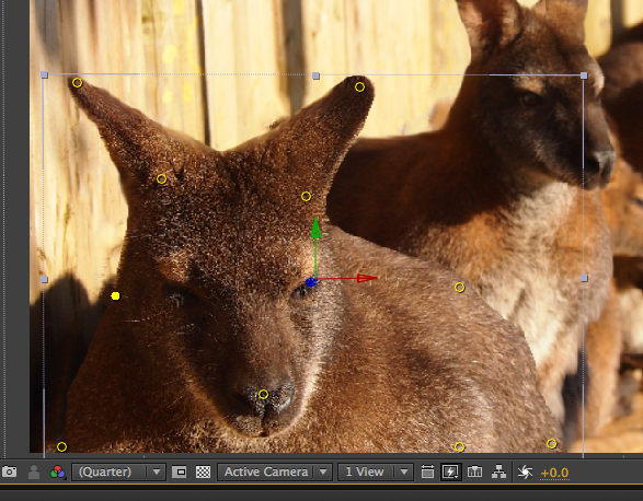 In addition to the 3D layer technique, I also tried out something new for me – the Puppet tool.
I pinned down some parts of the wallaby and tried keyframing some movement for the ears and nose afterwards.
This is how it turned out in the end. I really like the zoom effect that I can achieve with the 3D layer technique, and though the Puppet tool didn’t quite turn out how I wanted it to in this particular instance, I am positive I could get better effects with it if I spent more time on practice, because I acknowledge some different ways of using it more subtly.
Getting stock images:
Some of the images I’m using for my video are taken by me – mainly of the main character, i.e. my sibling, – but I couldn’t capture most of the others myself, so I searched for appropriate stock images online.
I used some images from ImageAfter because they allow you to use any images from the site without asking for permission or having to deal with copyright issues.
However, I searched for most stock photos on DeviantArt because I realised I could get more varied results and better quality images.
I always made sure to check every person’s rules for using the stocks, checking whether they required for you to ask for permission to use an image, or whether you’re allowed to use it outside of DeviantArt. If so, I didn’t use the image because I simply didn’t have time to negotiate to use a single image when there were a lot more to choose from. It is respectful to abide by a content owner’s rules, and thus staying away from copyright infringements.
Editing the shots, outlining their meaning – in the order as they appear in final video:
The first scene goes through the first 1 minute and 5 seconds – a continuous sequence of images.
I was inspired to create a similar effect to the one in the video because of how intriguing it was to watch the entire video, and it didn’t get boring even though the pacing was slow. The video shows a white background and the ‘main object’, and other highlights and shadows traced in color.
The person explained how they achieved the effect, but the problem was that I planned to edit my images primarily in Photoshop, so I needed an alternative method.
I remembered about an effect in Photoshop that allows you to edit an image and achieve a similar effect – the Trace Contour option.
 Whenever I work in Photoshop, I always use my Wacom tablet instead of a mouse because the strokes are more precise and it takes less time for me to finish an edit.
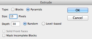 I edited the first test that I tried differently than I was planning to edit the actual image sequence, because I wanted to accentuate the effect and see how it looks.
I used the Extrude option to modify the image, resizing the pixels so that the spikes are sharper.
Generally, for all the actual images, I just duplicated the original layer and applied the Trace Contour effect to one image at a time.
 I kept adding the effect to all the next images while changing the levels slightly, so that when I fade them from one another in After Effects, the next image slightly differs from the previous.
 When I was done with each image composition in Photoshop, I then imported them in After Effects, making sure I import the .psd files as editable layers so that I can edit each layer separately.
The way I faded them into one another was simple – I just made sure every layer started at 100% opacity, and then I lowered the opacity to 0% one by one, starting from the top layer.
I decided to have a 2 second difference between the shots because then the transition was a bit slower to fit with the song, while at the same time retaining a level of speed so that it doesn’t get too boring watching the same image for a long time.
This is the first experiment I conducted to get an understanding of what to expect the effect to look like.
I was very pleased with how it looked, and personally I found it entertaining to watch even a single picture for almost 20 seconds, so I concluded that I didn’t need to edit too many images so that it doesn’t feel cluttered.
These are the images I used for the beginning sequence. I explain the relevance of each to show why I picked these certain ones.
All of these images are taken by me during the time my sister had come over to visit. Some of them were rushed, some of them were planned in advance, but in this case I didn’t need high quality pictures or specific backgrounds because the edited results look vastly different from the original photos anyway.
The video starts off showing the character happy and content with how life is going, which resonates with the bright effect style, but towards the end of the sequence, you see the character’s eyes being determined, as a buildup to the rest of the video.
I wanted the scene to be slow paced, and be contrasting to the atmosphere dominating the rest of the video. It would hint towards the contrasting states of mind the character has, ranging from upbeat to intimidated or even horrified.
I appropriately named each folder containing the .psd file, a .jpeg image of the composition, any screenshots and stock photos used so that I can refer to them easier when I edited.
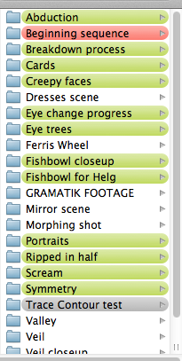
I later sorted the folders by colors – green indicating the images I had already animated, grey showing what shouldn’t be included in the video, red for something I decide not to use or re-edit later.
This just helped me keep organised so that I don’t get lost in my own footage and don’t end up wasting more time trying to find a file that wasn’t appropriately named.
Ripped in half:
 This is the next shot, which is probably the most direct in a sense because it obviously shows a person from whom two different sides are extracted.
The overall character is in the middle, staring directly ahead, and the two alters are on either side of her, being ‘dragged out’ by other people in a somewhat seductive way. I chose to use silhouettes so that the focus is on the main character, and the people behind the silhouettes shouldn’t matter in this situation.
I chose a purple background to place emphasis on the overall main person.
It is the starting shot for when the music intensifies, and I wanted at least one shot to be a bit more direct so that it sets the mood for the rest of the shots, which may seem random afterwards.
I decided to go for a particular color scheme – the main, or combined, person would be purple from the combination of her alters, red and blue respectively. The red would be the more hot-headed and impulsive character who is more fond of socialization, whereas the blue would be colder and reluctant to socialize – that’s how I wanted to set the scene where the red side seems keen on interaction, while the blue has turned away from the silhouette.
 The way I animated it was by starting the shot with the alters hidden behind the main character.
They slowly fade in and move to either side of her, and the silhouettes move at the same time in a distorted way, grabbing hold on each alter personality.
I used the Puppet tool because I felt like I could achieve better results with it to make the silhouettes move more fluently.
Portraits:
 I thought of the next shot to represent the character’s different alters, and just how many personalities she’s possible to summon.
It is basically a collection of portraits of various peoples’ faces, all staring directly at the camera, on a plain white background.
I chose the photos mainly based on the quality of the image and whether the person was staring in front, and I also chose more photos of females than males because it would be easier to grasp a female character having female personalities.
However, due to knowing how dissociative personality disorder works, I felt like I needed to find photos of males too – there have been cases of people whose alters are different from their biological gender.

The scene starts with a balloon appearing, and then a hangman’s rope fading in shortly after. The balloon is supposed to represent innocence and cheerfulness, whereas the rope is in contrast to it, representing deep rooted struggles, and as with the rest of the video, it can be interpreted in any way the viewer wants.

When the balloon disappears, the faces start fading in and out, beginning with quite happy expressions and moving onto more serious faces, and the entire time, the main character’s face is slowly fading in to represent her capability to switch to either of these alternative personalities.
I chose the white background because it would bring out the darker colors of the peoples’ faces, as well as being neutral so that the focus is purely on what’s in front.
I decided to invert the colors of the main character and change them to purple to retain a similar feel as the previous shot – the purple one contains every alter combined.
The people start flashing progressively faster after the person in the above screenshot flashes twice to the beat of the music to build up intensity, and I’m very pleased with how the shot turned out because of the simplicity of it.
These are the stock images that I used.
Fishbowl shot:
 This scene portrays the main character trapped inside a fishbowl, which may be taken in the literal sense of entrapment, or as if she’s being suffocated, while the rest of the world is going about its lives as peacefully as nothing ever happened.
I decided to use a contrasting black background to the white of the previous shot as a continuation of contradicting color schemes to fit with the topic.

I chose the seahorses because I had an idea for another closeup scene where I thought I could animate the seahorse to move by using the Puppet tool in After Effects.
I just thought they would add a majestic and peaceful feeling to the odd scene, and I really liked how the effect turned out.
In my opinion, it truly adds to the whole sequence as a calm before the storm, and at the same time the storm has already begun because the character is already suffocating.
Cards:
I chose this photo after the fishbowl scene because even though I still animated it in slow motion, it seems faster and more powerful, especially because the music intensifies at this point even more. I included a brief pause between the shots as the music paused, and I think that created an even bigger impact.
I wanted to recreate a surreal, dreamlike atmosphere with the cards being thrown towards the camera, and I also chose the man with a purple shirt (as well as adding a slight purple tint to the background) to hint towards this shot being a representation of the main character.
It really fits how the cards are mostly red and blue, seeming like the purple – or the ‘main’ person – is scattering the red and blue alters.
- Stock photo of vampire man
- Stock photo of cards
- Abstract texture stock photo
Abduction:
 This is the last scene from the middle part of the song.
I chose abduction as the theme because a previous bit of research stood out to me, when I was picking out dream term meanings. It signifies helplessness and not having control in your life, so I thought it was a fitting scene to include.
I placed it before the breakdown scene after this as the climax because I think it’s the most intense scene out of them all.
I decided to draw it by hand because I didn’t have any photos of her in that position. I also thought it would accentuate on the intensity of the scene if I left it mostly black and white. The only color in the scene is in the blue marks, seemingly where she’d dragged her hands as she’s being pulled away from the camera, and I thought blue would fit because of the blue alter being reluctant to socialize, feeling like interaction is forceful.
I also believe that the drawn style is an interesting addition to the whole video, contributing to the varying styles of each scene and drawing attention to it because it is different in another way.
The process of editing the images in Photoshop and importing them in After Effects stayed pretty much the same for every photo.
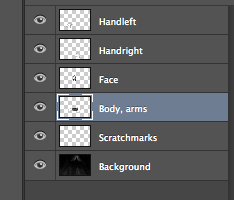
I would usually separate the layers that I want to move separately, in this case being the arms and hands of the character, as well as her body, and name them properly so that it’s easier to understand what is what later on.
Then, I imported the .psd file in After Effects, creating a composition for the scene, and keyframed the movement for each layer appropriately.
Scream:
 The next shot is of a human embodiment of negative states, screaming them out as an introduction to the breakdown sequence.
It starts off in the slow part of the song and gradually fades out to the next scene – it is meant as a trigger for the breakdown, even though it isn’t the direct reason for it.
 Editing this scene was a little different than the usual ”cut and paste into different layers”.
I decided to use this image, but I wanted to get rid of his hair to have a more neutral look.
I used the Clone Stamp tool to paste the parts of his forehead and cheek onto his head, and I think the result with the distortion on his head looked intriguing, as if it’s starting to bubble in rage, so I left it like that without smoothing it out.

 I inverted the colors of the image, and then tried out different hues to see which looked more menacing.
Evidently, I decided on a red tone, which made his teeth look more disturbing too.
Afterwards, I just manually wrote each word in a separate layer so that I can later animate them one by one. I thought that it would look too formal and straight if I were to type them using a set font.
As for the background, I wanted to have a psychedelic effect, but somewhat subliminal, so I just created many layers of the background, alternating the colors, and edited them to smoothly fade in and out from one another over a period of 2 seconds for each color.
Breakdown:
 The breakdown shot involves a twitching effect of the character and video footage of a disco ball as the background.
I wanted to retain the colorful style of the video, so I thought the addition of the disco ball was suitable to the atmosphere.
The disco ball goes in and out of focus, creating an even more psychedelic feeling.
Before editing the actual footage, I first tried out the effect by creating a GIF, and I thought it looked quite disturbing, which was a positive observation.
However, the music is quite slow, especially since the breakdown is introduced in the slower part of the song, so I figured it would be more appropriate to slow it down a little, whilst still having fluent movement.
I resolved this issue by using a tactic I had used before – the fades from different colored background photos in After Effects, only over a shorter duration of time. 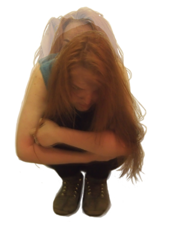 As the editing was always about changing the opacity, this kind of movement seemed more appealing, and it also allowed for multiple images to be shown at once for a more intimidating look.
It doesn’t look as sharp and rough as the previous GIF, and it definitely fits better with the smooth, out-of-focus background.
Below are the images I took of my sister. I wanted to have low light so that she isn’t thoroughly illuminated, and the least occupied place with such lighting turned out to be a restroom. It was quiet and people didn’t walk in at all, so we weren’t disturbing anyone, and nobody ended up disturbing us, either.
I told her to change positions sometimes, but still retain the original posture, and that way the whole image sequence seems like it’s in the same spot while still having movement.
Eye trees:
 This image is the main focus of the breakdown scene following the shot of my sister.
It may be interpreted as a realisation shot – it is a turning point from the breakdown to the following nightmare sequence.
 The original photo depicts a closeup of an eye, but I had an idea to edit in trees to be as blood vessels.
They would represent a hidden meaning, or that things are not as they look.
I thought the finished edit looked quite realistic, but it’s easy to tell that those are not actually blood vessels when you zoom in, so I thought it would be a fitting slow shot to pan down from the eye, revealing the trees, and moving them with the Puppet tool in a distorted way.
Afterwards, it zooms out and shows the full image of the eye, and then zooms out even more to reveal the character’s face.
 I didn’t really have to do much editing in Photoshop – all I did was extract the tree branches, each on a separate layer, and then locked the layers to precisely colour them dark red, with brighter red spots in other places so that it doesn’t look too flat.
I thought it really added an eerie atmosphere and contributed to the overall scene.
Continuation of eye shot – zooming out to character: The previous shot zooms out to reveal that the eye belongs to the main character.
I chose the bright yellow background and tint to emphasise on the color scheme, creating a striking appearance and drawing attention to itself.
I decided to have a cut off transition from the eye picture zooming out to the character appearing on purpose – I wanted to somehow show disconnection from oneself, and at the same time reminding that the eye still belongs to the character.
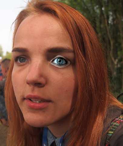 The initial problem with the original photo was that she wasn’t looking in the camera in the original photo, so I had to make adjustments.
I selected roughly around the eye stock photo and resized it properly to believably fit as my sibling’s eye.
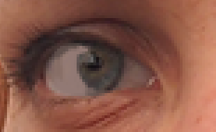 I wasn’t going to make huge edits to the other eye, but I still needed it to be facing the camera so that it looks more believable.
I selected the pupil and placed it in another layer. I then copied the color from the sclera and roughly drew over the part of the pupil that was more on the left in the photo so that I can move the pupil more to the right.
 I checked with the other eye to see whether she seems to be looking in the same direction, and concluded that the position of the pupil was more or less correct.
I also lowered the opacity on the Eraser and started working my way around the right eye to get rid of the excess skin from the other picture and make it blend in better.
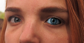
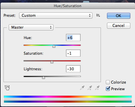 I increased the size of the iris in the left eye to match with the size of the other, and then I changed the lightness, saturation and hue of the right eye to match with the color scheme of the photo as a whole.
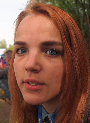 This is the finished result, and I’m very pleased with how it turned out.
I think it looks realistic enough, especially when the shot doesn’t last that long for people to try to notice something. This is a comparison I made to show the changes.
Symmetry:
 I chose to show this shot straight after the yellow shot of the character so that it’s in high contrast from the bright yellow to the dark blues and reds, and I wanted to represent the alter personalities clashing together, maybe a manifestation of the realisation that the character had experienced after the breakdown. I had an idea of the butterfly wings hinting towards a rebirth.
It is a start to the next nightmare scenes, introducing both dark colors and brighter highlights.
I decided to create a symmetric image because I wanted to give it a creepy feel, alongside the evil grin of the man.
Creepy faces:
 This next shot comprises a bunch of intimidating faces, which is a version of a shot I had thought of using in the beginning of the project development, when I was considering shooting video footage.
The faces are drawing closer to the camera, especially the one in the middle, and I wanted to convey a fearful mood, as if you’re being taunted.
 I added a purple and brown/yellow/orange color filter to show the battle of the main person – purple color – and the newly formed personality which is portrayed as yellow.
Veil shots:
 This shot is less colorful to emphasise on the colors of the woman’s skin and face.
It portrays a lady in a black dress with a veil covering her face, and she’s confidently moving her arms upwards.
It doesn’t show her face in this shot, only a glimpse of her red lips, which adds a mysterious atmosphere.
 This is a closeup of her face, the gloved ghost hands taking the veil off and revealing what’s under it. I thought it would be more ghastly if they weren’t her own hands taking the veil off, suggesting that it isn’t in her control to show or hide her true colors.
Her face is decorated with makeup – one side red, the other – blue. They show the two sides of the first two personalities.
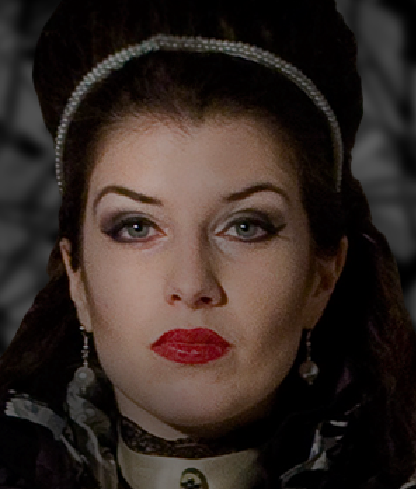
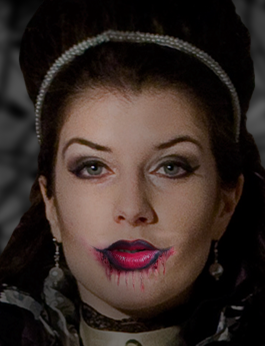 The original photo didn’t have the excessive makeup on – I edited it on from another stock photo.
 I changed the colors and lightness to fit with the woman’s face, primarily going for a dark red tone.

 I then created another layer for the blue side, adding in the eye shadow and creating another layer for that as well. I had an idea that I could animate it changing colors – from a striking red to the cooler blue over the duration of the shot.
As shown in the screenshots, I also wanted to add a slight tint of each color for either side, giving the red a warmer look, and the blue feeling colder, respectively. I did this by creating another layer and brightly laying down the colors with the Brush tool. Then I lowered the opacity as needed, just enough to give a subtle indication of the colors, but not excessive and obvious.
In the end, I just cropped out a part of a dress from another stock photo to use as the veil because I figured it would be easier to make it semi-transparent instead of using an actual veil in front of another person’s face.
- Stock of lady in black dress
- Stock of abstract background texture
- Stock of the makeup used
- Stock of the dress used for veil
Dresses scene:
 I wanted to create this dark scene to complement the macabre atmosphere set by the previous few shots, and to continue the nightmare theme throughout the rest of the video.
It portrays the main character in the middle, arms outstretched, and surrounded by women in dresses whose faces are distorted. I didn’t really have any ulterior motive for choosing the images of women in dresses, apart from simply keeping within a set theme so that the people around the character aren’t entirely random.
I took inspiration from one of the dream meanings I had researched before:
To see a faceless figure in your dreams indicates that you are still searching for your own identity and finding out who you are.
It was the reason I chose that particular photo of my sibling – as if she seems inspired and motivated to proceed with live, regardless of being surrounded by darkness. It may also be interpreted in the opposite light – that she wants to find out who she is, but she’s trapped in this confusing vortex in her mind.
 I first built the foundation of the scene, placing the character in the middle, creating the textured background, and placing the women in dresses in their appropriate positions – some closer, some farther from the camera to give the scene a more spacious look.
I added a fitting set of colors, called EdgyAmber, because the golden tone fit nicely with the backdrop primarily comprising reds and oranges.
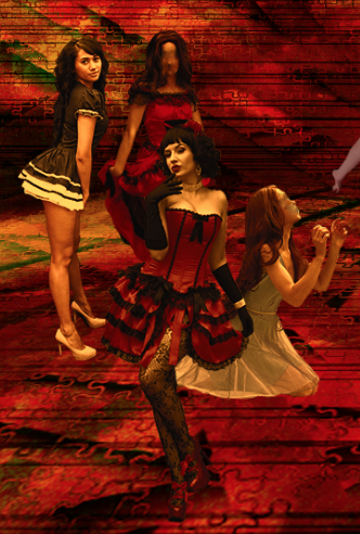 I added the color scheme for each person, making sure the overall look of the scene is consistent. Then, I used the Smudge tool to distort their faces until they’re indistinguishable.
When I imported the scene in After Effects, I animated all the characters with the Puppet tool, moving almost unnoticeably, yet adding to the uncanny atmosphere.
Ferris Wheel:
 I had a very different kind of shot in mind, depicting a silhouette of a Ferris wheel to symbolize that life is full of ups and downs, and it always starts somewhere and eventually ends somewhere.
I went for a plain blue background to fit within the minimalistic style of this scene – the silhouette is just plan black, so I figured the background shouldn’t be too complex either, considering the focus is meant to be on the silhouette.  I wished to animate just the wheel, rotating it fully once with staccato turns, then twitching back and forth and getting more disturbing because the carts in the wheel don’t move according to gravity – they’re stuck in one place because essentially it is a still image.
I liked that effect because it added some uneasiness to the scene, symbolizing awry perceptions.
This is the stock photo I used:

Mirror scene:
 The mirror scene is meant to stand for the fear and uncertainty surrounding the character.
She is looking into the mirror, her face is in distress, and there are hands coming out of the darkness within the reflection – either her alter personalities’ influence or societal pressure, depending on the viewpoint the individual takes when watching the film.
I explain the process and show an example of how the animating looked in this video:
Walking glitch:
 The ending shot is glitchy scene where the character walks away from the camera.
The character keeps glitching between steps and colors – red, blue for the first alters, purple for the overall person, and yellow for the third alter – in sync with the beat of the music, and can be interpreted in a number of ways (walking away from her troubles; glitching because unable to figure herself out, so all she can do is continue switching and go with the flow of life; realising who she is and what she’s dealing with, and the only thing she can do is keep moving forward).
I wanted to create a different effect, a more neutral one than the nightmarish ones shown before, so I thought a glitching effect would be most suitable.
I had already taken an array of photos of my sister waling away from me, so I believe I was inspired by the footage I already had.

 I was editing the Curves of the background to look more like a screen glitch than an abstract backdrop.
I decided to invert the colors of each layer of the character because it gave the scene a more computerized look.
Then, I randomly changed the hues for each layer, mostly showing red/blue/purple/yellow, according to the alter I wanted to portray.
I animated the layers in Premiere because it was easier to follow the audio waveform than in After Effects. All I did was just change the lengths of each layer according to the music beat, without any transitions so that it looks as abrupt as a glitch would.
 As I was editing, I noticed that a still background looks too bland when there’s such fast movement going on in the foreground. I thought it would be beneficial to the aesthetic look to make the background shake a little, but I didn’t know how to quickly do it in After Effects of Premiere.
The only effect I could think of was the Earthquake effect in Final Cut Pro, so I decided to add that to the image and export it as a video.
I thought it made the whole scene more vibrant, so this constant switch from program to another program was a success.
Overall edit:
 The only issue I faced with After Effects was trying to use one music track over several compositions.
I asked my tutor David for advice, stating that I wanted to work on each scene in a separate composition to keep all the numerous layers organized, but having the same audio track visible while I work in any composition.
David was trying to work out how to solve this, but we mutually concluded that the best way to go around it is to just copy the audio track in every composition to follow, and mute or delete it after finishing the scene.
 I started having trouble keeping up with all the compositions, so I decided to render and export each scene as a separate video and edit them in Premiere on the go.
As shown in the note, I was making calculations about the length of each shot as I was rearranging their order to go along with the music.
 I also had a sheet with notes of how to edit and what to pay attention to – certain visual details – so that I can consult them as I worked in After Effects to achieve a better result.
 I had filmed some video footage when I had gone to a concert, and I really liked the dark mood in the location. I was filming the ground, which reflected the lights from the disco ball, casting shadows of the people dancing, and the lights were constantly changing abruptly.
I thought it would be fitting to use those shots as transitions between the first nightmare sequence to accentuate how society has a dark influence on the main character.
Overall, I liked the result – I thought it added more flavor to the scenes and made them more menacing by twitching in between.
This is the finished video:
In short conclusion, I am satisfied with the end result because I achieved the mood I had intended.
I wanted the video to go along with the music, to have an uncanny atmosphere and to be visually enticing.
I exercised my working speed and improved my skills working with Photoshop and After Effects, and as a result I would feel more confident to use similar techniques in my future works.
(Detailed evaluation on my Reflection and Evaluation page.)


